A better first
impression.
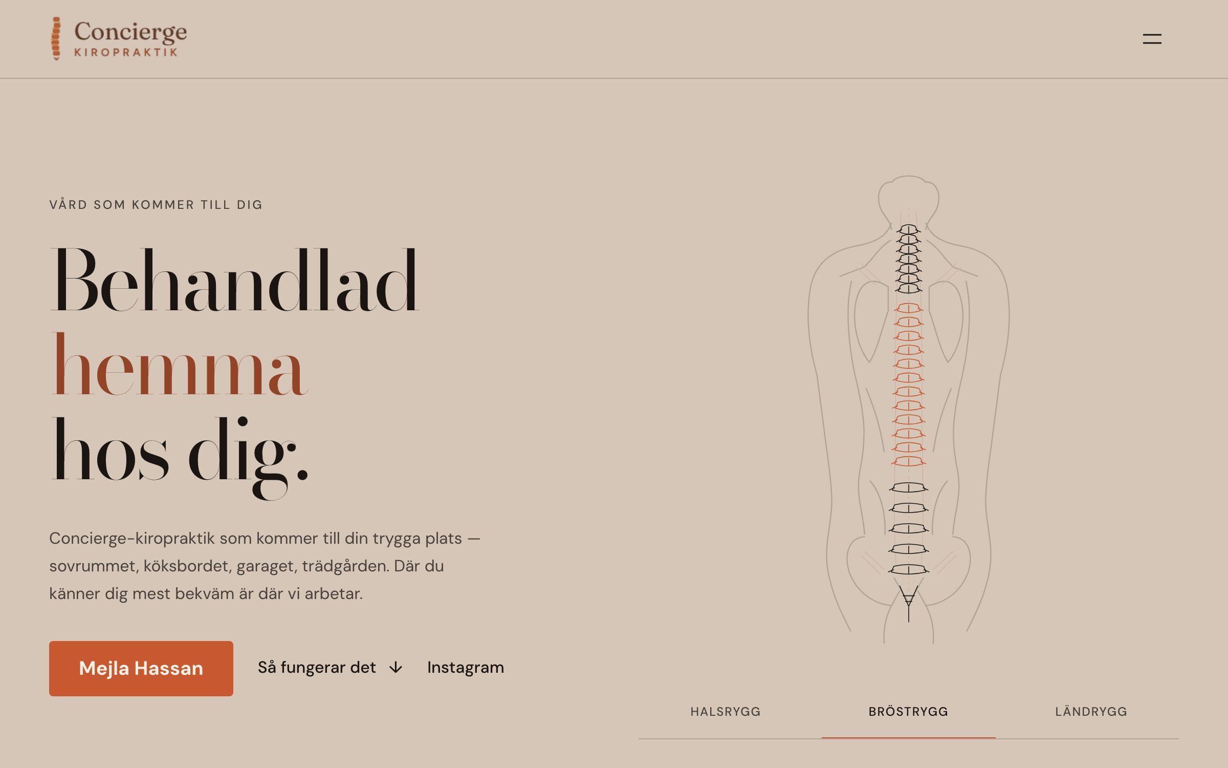
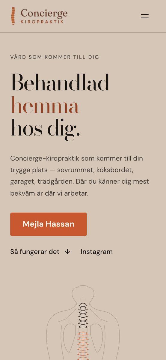
Website for Concierge Kiropraktik, chiropractic care that comes to you in Stockholm: a calm design, clear treatments and an easy path to the first visit.
- Type
- Chiropractic clinic
- Status
- Client website
- Tools & technology
- Next.js, TypeScript, Responsive design
CHIROPRACTIC CLINIC
CONCIERGEKIROPRAKTIK.SE
Context
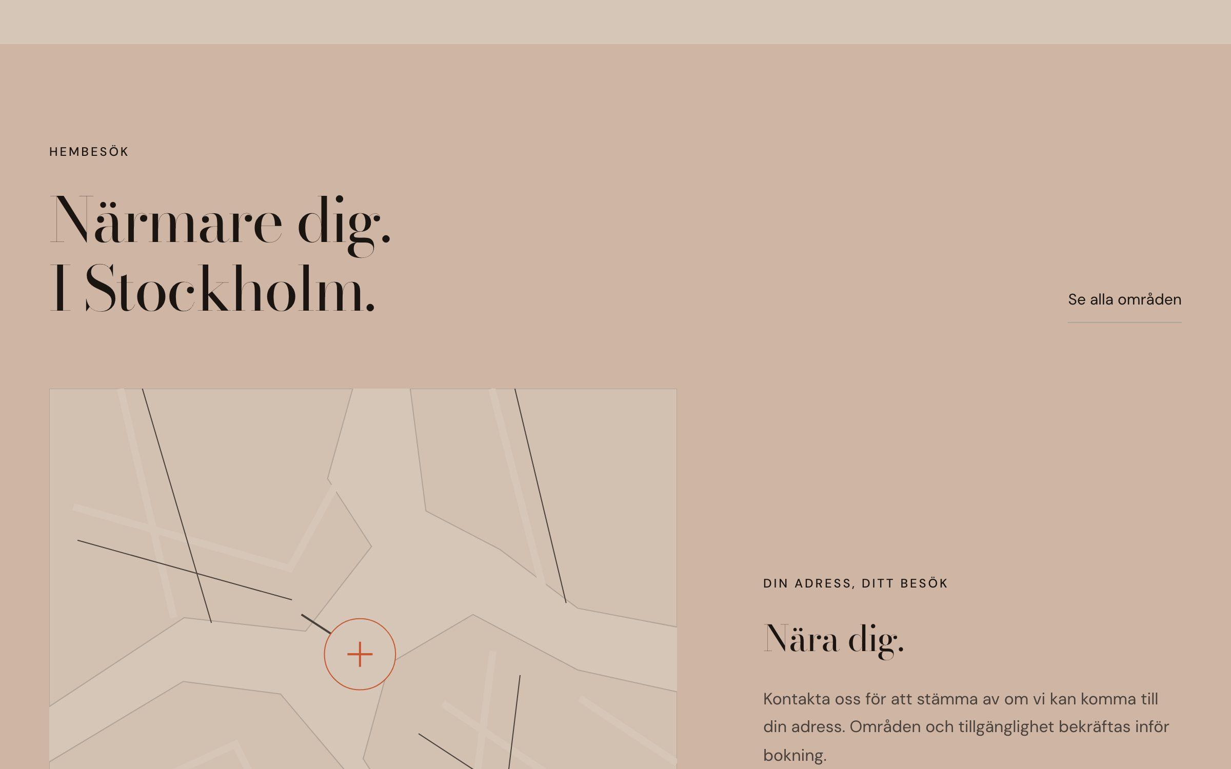
Concierge Kiropraktik comes to the patient: the living room, the office, the garage. It is an unusual setup, and people who find the site arrive with pain and questions. The site has to explain how a home visit works, build trust in the chiropractor and make the first contact feel easy.
My role
Design and development: structure, copy hierarchy, visual direction, responsive build and launch.
Process
- Mapping the questions a new patient has before getting in touch: price, areas covered and whether a referral is needed.
- A calm, warm visual language with editorial serif headings and an illustrated spine showing what is treated.
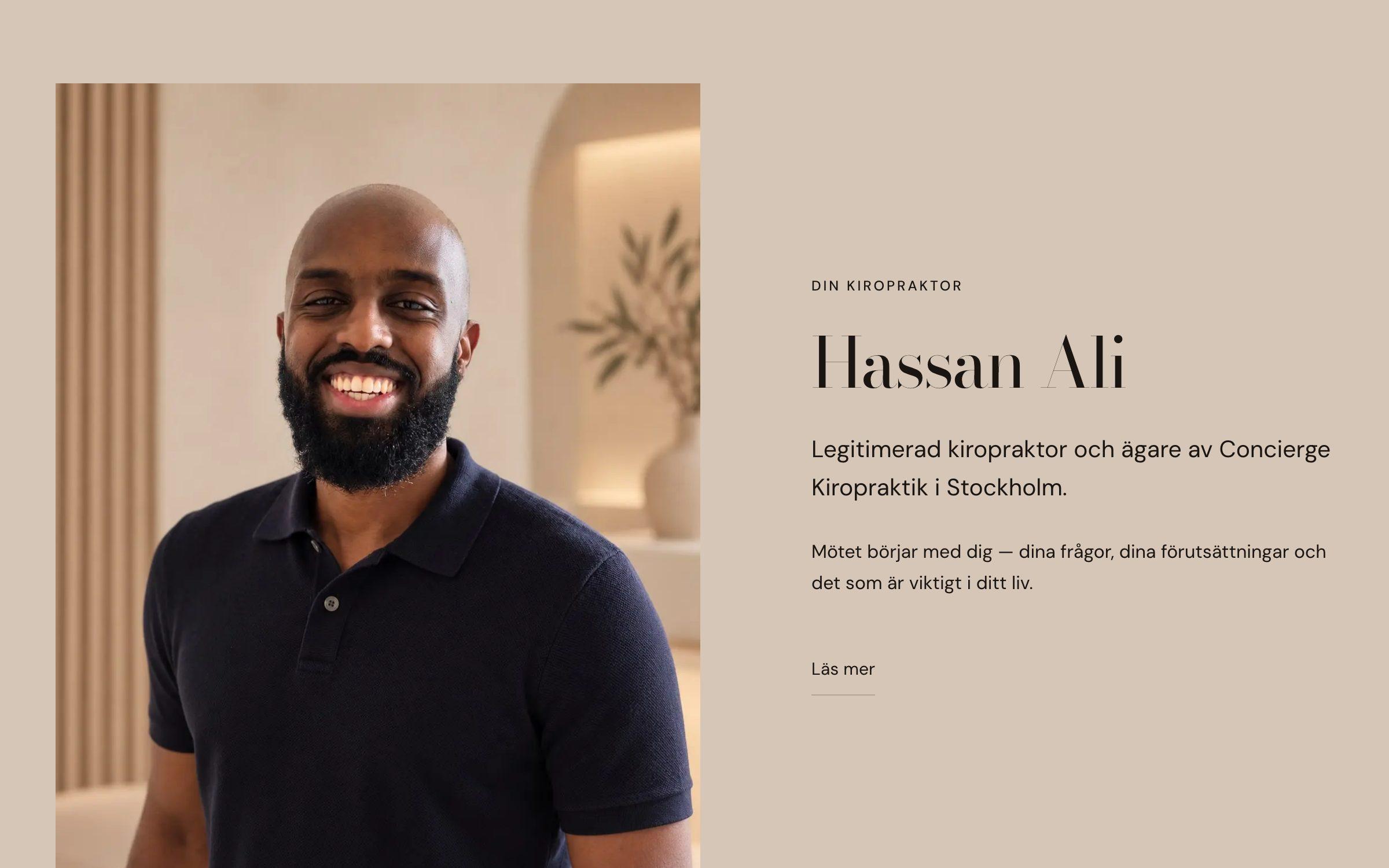
- Introducing the chiropractor early, since trust in the person is what sells a home visit.
- Keeping contact one tap away by email or Instagram, without long forms.
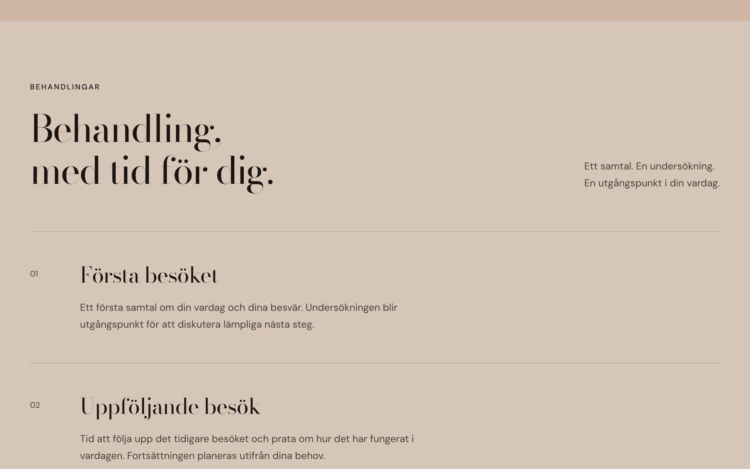
- Separate pages for treatments, areas, how it works and frequently asked questions.
—A closer look
Outcome
A live website at conciergekiropraktik.se that explains the home visit, introduces the chiropractor and leads visitors to a first contact.
What I learned
- Clarity is a form of care.
- Fewer choices on the way to booking means fewer drop-offs.